Typographic posters
Expressive typographic illustrations, inspired by the interviews in Dysfluent Issue 2. Each poster is inspired by the uniqueness of the person's voice. These posters twist, disregard and play with legibility.
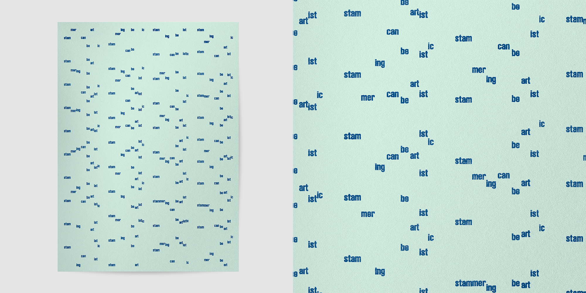 ↑ Poster 1: “Stammering can be artistic”
Inspired by Patrick Campbell's repeated syllables and patient prolongations.
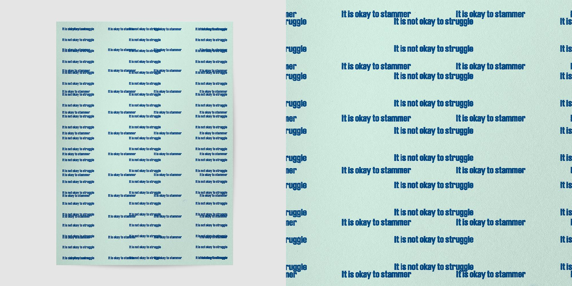 ↑ Poster 2: “It is ok to stammer, it is not ok to struggle”
Inspired by the ideas of contrast and tension in Penny Farrell's statement (Penny does not stammer).
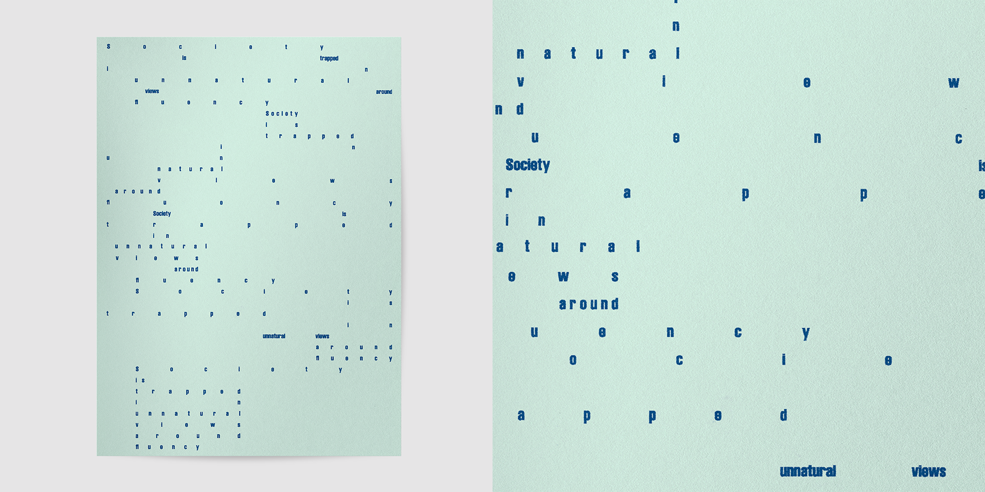 ↑ Poster 3: “Society is trapped in unnatural views around fluency”
Inspired by Jack Nicholas' intermittent blocks.
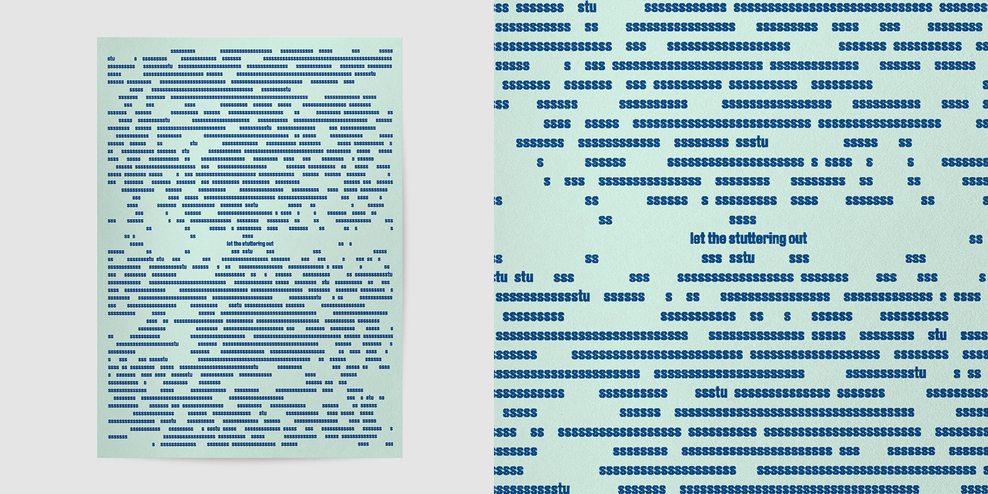 ↑ Poster 4: “Let the stuttering out”
Inspired by Kristel Kubart's delicately repeating consonants.
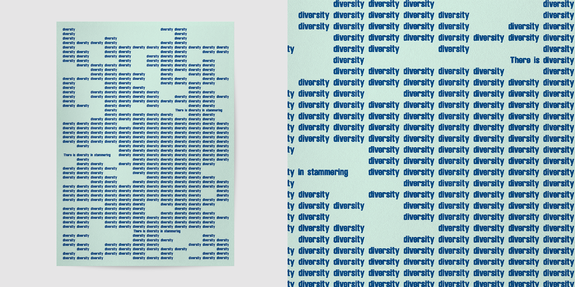 ↑ Poster 5: “There is diversity within stammering
Inspired by Puneet Singh Singhal's full-word repetitions.
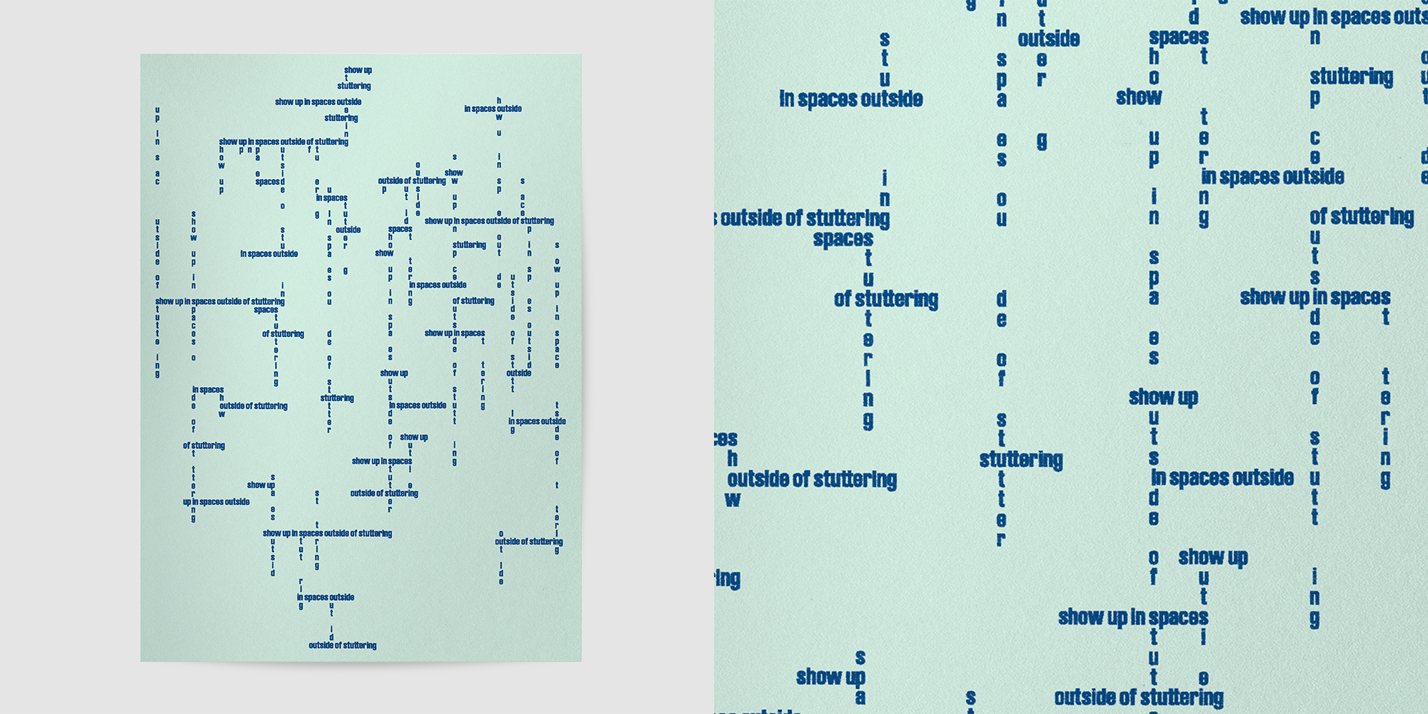 ↑ Poster 6: ”Show up in spaces outside of stuttering”
Inspired by Maya Chupkov's covert stammering and mid-word stretches.